


The 7 Best and Worst G7 Logos
Not all summit logos are created equal.

Longtime fans of Cansler Culture will know I have a slightly unhealthy obsession with logos for the G7 summit, the annual edition of which kicks off in Italy today.
The G7—an unofficial/official group of democracies and large economies made up of the US, UK, Canada, France, Germany, Italy and Japan—holds a summit every year.
And the logo is always different.
For a long time I complained about this. Just pick one logo and stick with it! I’d say. Then someone made the point that the G7 isn’t an organization with a permanent office or staff. It’s more like a group chat that meets IRL once a year. Its profile pic changes with the political winds. (It was also temporarily the G8 for about 15 years when Russia was in the chat.)
As far as I can tell, the summit host countries didn’t start consistently making logos until 1994, but it’s now an annual tradition.
And boy are these logos a mixed bag. So I took the liberty of ranking them.
Now, I present to you: The 7 Best and Worst Logos for the G7.
Worst: 2019, France
It’s not bad, per say. It just incorporates too much France. It’s like—we get it, the summit is in France.

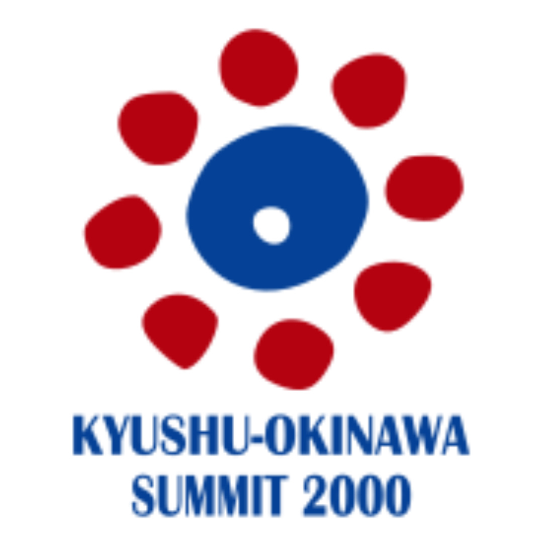
Best: 2000, Japan
Solid mixture of unique cultural style and representation of leaders around a table.
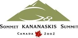
Worst: 2002, Canada
Color: bad. Typeface: bad. Style: bad.
Best: 1994, Italy
Great job working in the Napoli blue and the brushstrokes are well placed. Bonus points for doing this with what I assume is Photoshop 1.0.

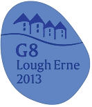
Worst: 2013, United Kingdom
I have to assume a child made this for a contest.
Best: 2012, United States
Did they maybe take the camp theme a little too far? Sure, but it’s fun.

Worst: 2006, Russia
It’s a weird shape and I don’t know what it’s supposed to be representing.
Best: 2023, Japan
Color scheme great and typeface on point, and nice job working in the Japanese flag.

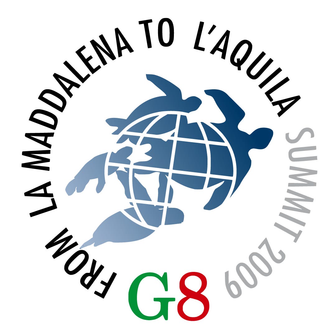
Worst: 2009, Italy
Ugly gradient combined with weird clip art.
Best: 1999, Germany
So much to love here—the German modernism, the subtle work-in of the flag and Cologne cathedral, the simplicity. It just works.

Worst: 1996, France
I have no words.

Best: 2014, Russia
The summit that never was… Russia annexed Crimea before the summit was held so it was kicked out of the chat. Bit of a shame only because the logo is a nice minimalist vibe.

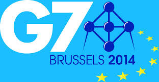
Worst: 2014, Brussels
After Russia got kicked out they scrambled to host the 2014 summit in Brussels. The logo certainly communicates the “last minute” feel.
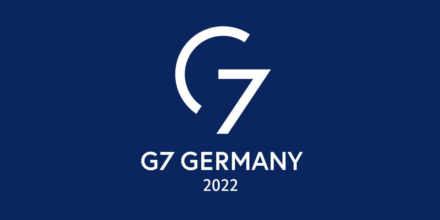
Best: 2022, Germany
Absolutely no G7 logos doing it like this one. It’s simple, clean, versatile.
No notes—just icon status.
Anyway, check out the entire logo history here. Let me know what I snubbed.